Live Life Learn is a disability service provider supporting individuals and families
through care, education, connection, and independence.
Their brand needed to feel cared, inclusive, uplifting, and empowered.
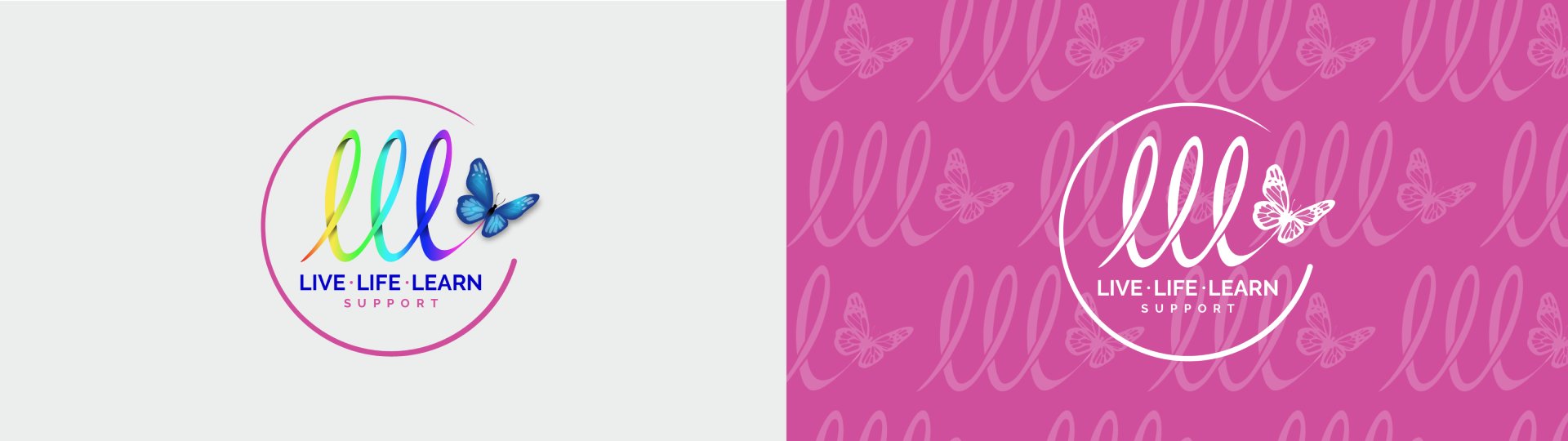
Logo
Logo Animation
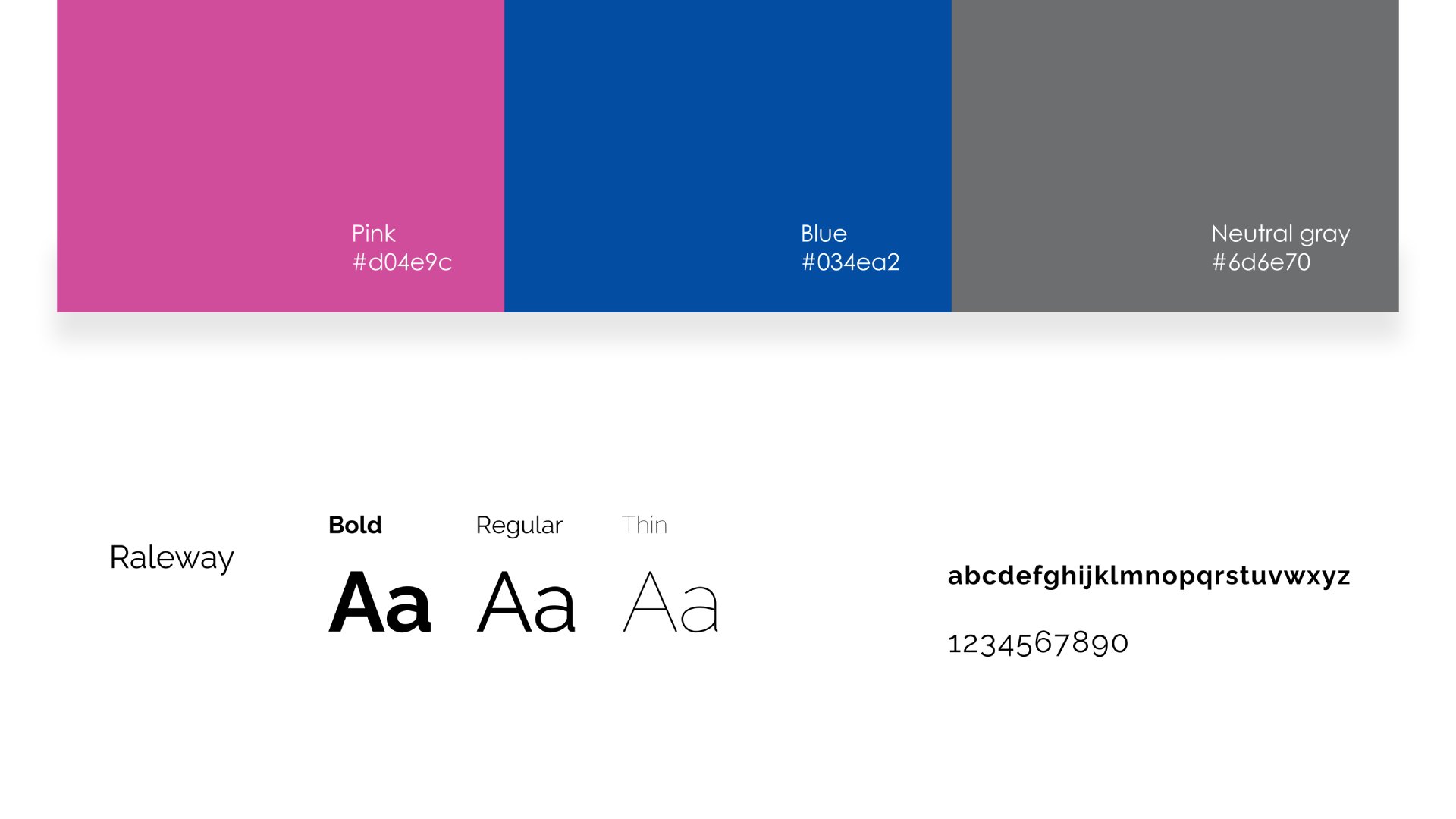
Color and Typography
The color palette is inspired by calm, nature, and positivity, creating a sense of care and warmth across all touchpoints. Typography is clean and highly legible, chosen to ensure clarity, accessibility, and friendliness, while maintaining a professional and trustworthy tone.
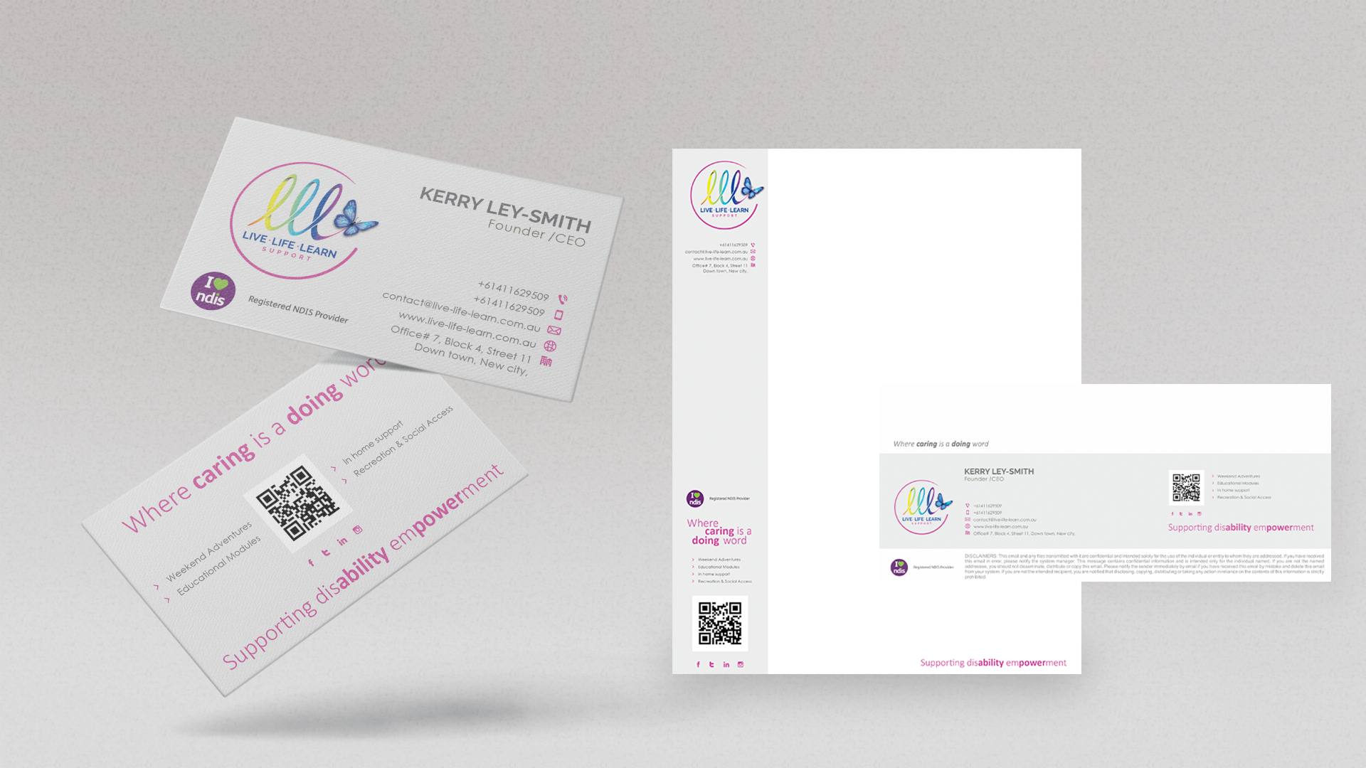
Applications
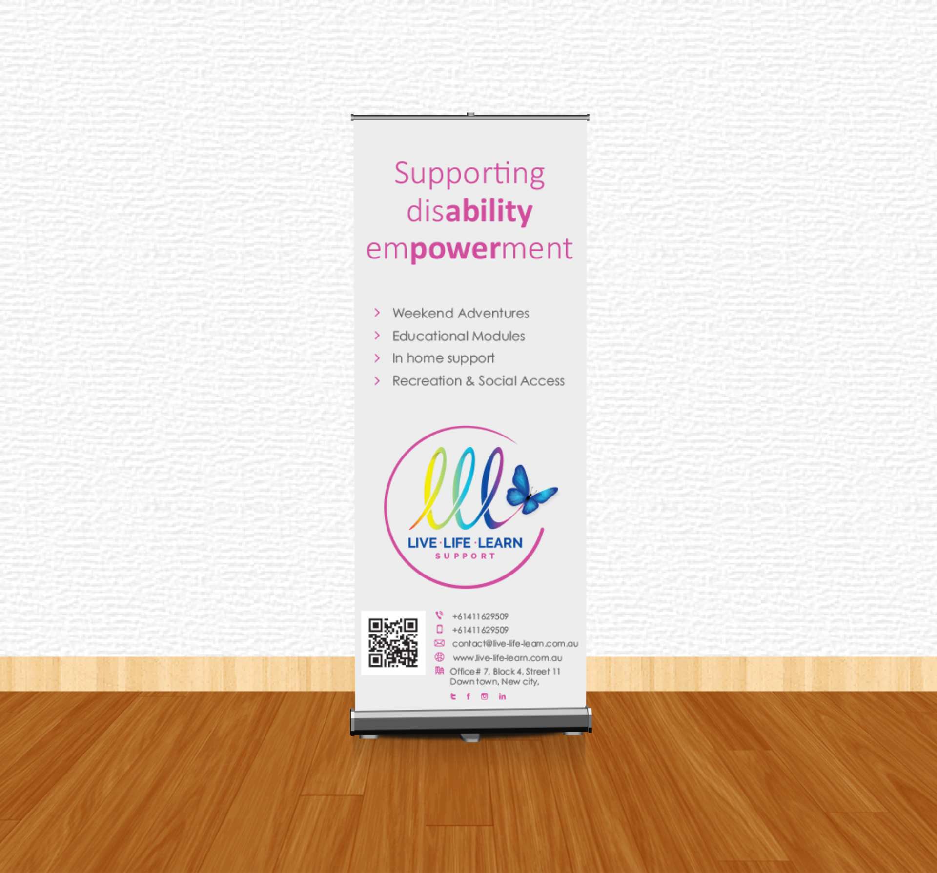
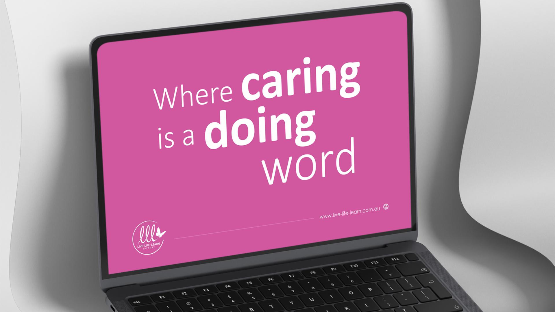
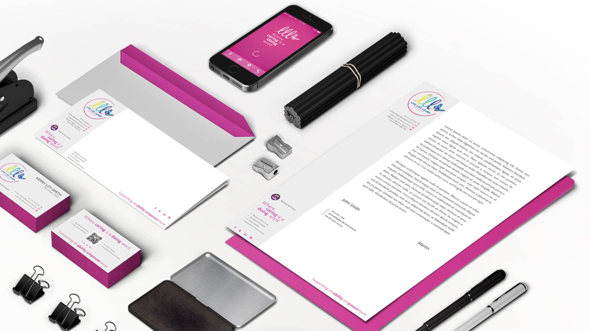
The brand system was applied across all communication materials with precision and purpose. Business stationery and digital assets were designed to function effortlessly while maintaining a consistent, welcoming aesthetic – allowing the brand to communicate with clarity, care and warmth.
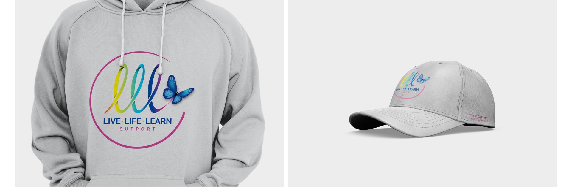
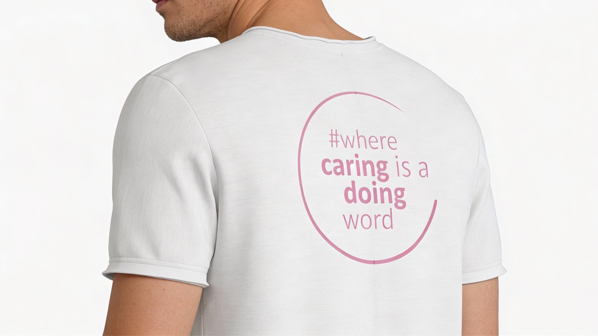
The merchandise was designed to be inclusive, and wearable with pride. Simple layouts and subtle branding allow staff, carers and community members to feel connected to the brand while reinforcing visibility and unity within real-world environments.
A compassionate brand identity designed to empower lives, strengthen community, and support every journey with care.
If your brand deserves the same kind of digital elevation, let’s talk about your next transformation.