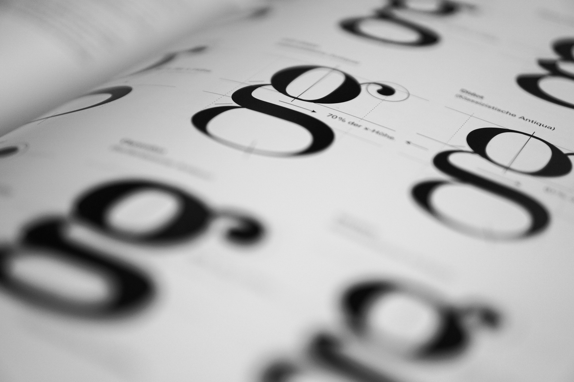
In the digital age, typography is far more than just letters on a page. It’s a critical element of design that can define your brand’s personality, convey professionalism, and set the tone for your audience’s experience. The right typeface makes your content feel modern and fresh, while poor choices can make your design look outdated in an instant. Whether you’re designing a website, marketing material, or a corporate presentation, choosing the right typography is essential.
Here’s a comprehensive guide on typography choices that ensure your brand feels current, stylish, and professional.
The Importance of Modern Typography
Typography communicates far more than the words themselves. It influences readability, user experience, and brand perception. In an era where attention spans are short, modern typography helps you:
- Build Trust: Clean, legible fonts show professionalism.
- Enhance Readability: Well-chosen fonts improve comprehension across digital and print platforms.
- Express Brand Identity: Typography conveys personality, whether sleek, playful, or authoritative.
- Stay Relevant: Modern fonts reflect current design trends without being faddish, keeping your brand looking contemporary.
Modern Typography Do’s
1. Embrace Sans-Serif Fonts
Sans-serif fonts, like Helvetica, Futura, and Montserrat, are the epitome of modern design. Their clean, straightforward lines create a minimalist, uncluttered look that feels fresh. These fonts are ideal for digital media because they maintain readability on screens of all sizes.
2. Prioritize Legibility
Modern typography isn’t just about style; it’s about function. Choose fonts that are easy to read across devices. Avoid overly ornate scripts for body text—they may look elegant but can hinder readability. Headlines can experiment with stylized fonts, but clarity should never be sacrificed.
3. Use Variable Fonts for Flexibility
Variable fonts allow a single font file to provide multiple weights and styles. This flexibility means designers can achieve a wide range of looks without cluttering their design with multiple font files. Variable fonts help maintain a cohesive, modern aesthetic while improving performance on digital platforms.
4. Combine Fonts Strategically
Pairing fonts correctly can elevate your design. A common modern pairing is a bold sans-serif headline with a clean serif body font. The contrast draws attention without looking chaotic. Avoid using more than two or three typefaces in a single design to maintain a polished, contemporary feel.
5. Use Generous White Space
Modern design embraces minimalism, and white space is key. Giving your typography room to breathe increases readability and adds a sense of sophistication. Crowded text can make even the most stylish font feel outdated.
6. Pay Attention to Weight and Hierarchy
Modern typography relies on hierarchy to guide the reader. Bold headings, medium-weight subheadings, and lighter body text create a visually appealing flow. Proper weight and hierarchy help users navigate content intuitively, which is essential for a professional and contemporary look.
Typography Don’ts
1. Don’t Rely on Overused Fonts
Classic fonts like Times New Roman or Comic Sans are familiar but often feel outdated. Using them can signal a lack of design awareness. Opt for fresh alternatives that retain readability but look current.
2. Avoid Excessive Styles
Mixing too many font weights, styles, or decorations can create visual chaos. Overuse of italics, underlines, or shadows can make typography look cluttered and old-fashioned. Stick to clean, consistent styling.
3. Don’t Ignore Screen Compatibility
Fonts that look great in print may not render well on screens. Avoid fonts with fine details or tight spacing that compromise legibility on mobile devices. Always test your typography on multiple screen sizes.
4. Avoid Overly Decorative Fonts for Body Text
Script, ornamental, or highly stylized fonts are suitable for logos or headers but rarely work for paragraphs. Overusing decorative fonts makes your content difficult to read and can make your brand appear amateurish.
5. Don’t Follow Trends Blindly
While modern typography embraces current trends, jumping on every fad can date your design quickly. Stick to timeless, versatile fonts with subtle contemporary touches rather than transient gimmicks.
Tips for a Contemporary Typography Palette
- Neutral Sans-Serif for Body Text: Fonts like Lato, Open Sans, or Roboto work well across industries.
- Bold Sans-Serif for Headlines: Fonts like Proxima Nova or Montserrat create impact while staying modern.
- Limited Accent Fonts: Use a secondary font sparingly for quotes or highlights.
- Responsive Sizing: Modern typography scales across devices; headings, body text, and spacing should adjust dynamically.
- Consistent Line Height: Ensure enough line spacing for readability; cramped lines look dated.
Typography Trends That Still Feel Timeless
- Geometric Sans-Serif Fonts: Clean, circular shapes feel sleek and futuristic.
- Minimalist Serif Fonts: Modern serifs like Freight Text offer a classic touch without feeling old-fashioned.
- Variable Fonts: Flexibility allows dynamic weights for headers and body text without font clutter.
- Subtle Contrast Pairing: Combining a neutral sans-serif with a slightly stylized serif creates depth without clutter.
Conclusion
Typography is more than decoration; it’s a reflection of your brand identity. Modern typography balances clarity, style, and function to ensure your design looks current without feeling forced. By prioritizing legibility, embracing clean fonts, using thoughtful pairings, and avoiding overused or overly decorative styles, you can maintain a contemporary look across print and digital platforms.
Remember, typography is the silent ambassador of your brand. The right choices make your content approachable, professional, and visually engaging, while poor choices can date your brand instantly. Stay mindful, stay selective, and your typography will always speak modernity.